
Tech
Maximalist Web Design: Digital Boldness Without Apology

Maximalist web design rejects modesty. It slams the door on safe choices, and celebrates intensity. Many designers cling to minimalism, yet maximalism kicks through that quiet wall. It roars for attention, saturates the screen with gusto, and reclaims drama in the user experience.
If you’ve not been much acquainted with maximalism, here’s a blog that you should read. It shows you the right mindset to approach this top rated web design model.
First things first—
Philosophy of More
Maximalist design follows a simple vow. More imagery, more personality, and more sensory data. It pulls from art, fashion, gaming, and eclectic print media. Then without hiding influences, it blends them like paint in a crowded studio. The goal rests in depth.
A maximalist site may feature overlapping elements or throw gradients across the screen. It may also play with nostalgic motifs from past decades or summon pop art energy. Every shape has an attitude. Every line carries intent.
Colour as a Weapon
Colour drives the soul of this top-rated web design.
- Neutrals take a seat in the back row.
- Deep reds and citrus yellows claim seats in the front.
- Neon tones spike the eye.
- Jewel shades stroke curiosity.
- Contrasts clash on purpose.
Moreover, palettes cross genres without shame. A site may pair hot pink with midnight blue. Another may layer lime green over polished charcoal. There are no hesitations.
Typography With Teeth
Type in maximalist design lives like a headline act. Letters stretch, swell, and bend the usual rules. Fonts may mix within one scrolling area. For example, bold slab serifs may sit with tall condensed sans fonts or decorative scripts may leap beside pixel-styled characters. Size changes add shock value, while weight variation builds rhythm.
Overall, each word becomes an artwork, and the page glows with typographic personality. But remember that it’s not random; there’s a technique to execute it.
Imagery That Feels Alive
Pictures fill a maximalist universe with abundance.
- Photographs may overlap with illustrations.
- Textures may wrap behind icons.
- Animated pieces may drift across panels.
- Hand-drawn accents may appear beside cosmic vector art.
Some sites also mimic magazine spreads, while others channel concert posters. Each one injects personality into digital space. Imagery may carry metaphors that ignite curiosity or shock for fun.
Layers, Patterns, and Dynamic Motion
Flat layouts retreat in maximalist environments, so layers step forward. Overlapping panels create depth, patterned backgrounds frame content, and repeated motifs appear in borders or headers. Stripes, checkerboards, splatters, waves, and tessellated shapes may coexist on one screen.
Motion also adds flair without apology.
- Scroll-triggered animations float into view.
- Parallax effects create illusions of space.
- Hover states reveal hidden textures.
- Video loops may pulse behind banners.
Motion guides the eye in ways still anchored by structure.
Structure Beneath the Spectacle
Maximalism does not destroy usability or navigation. It respects human attention and amplifies experience instead of confusing it. Clear menus and logical hierarchy still breathes under the ornament, balancing spectacle with direction.
Layout grids still hold the explosion in place and allow wild visuals to sit within boundaries. A viewer may feel hit with an artistic storm, yet still find the call-to-action. Functionality lives within the artistry.
Emotional Impact and Brand Identity
Many sites fade from the mind and slip into the generic fog of sameness. Maximalism rejects that fate and carves identity with force. It leaves mental imprints even after the tab closes. So, brands with bold voices often benefit from this approach. Music labels, fashion houses, gaming studios, event platforms, creative agencies, and cultural spaces find comfort in it.
Each page tells the audience to feel something. That feeling persists.
Storytelling Through Excess
Narrative thrives in maximalist spaces.
- Imagery and typography support the message.
- Each color choice speaks in metaphor.
- Textures hint at tone.
- Layout directs the plot.
Ultimately, users move through chapters without realising it. One panel may drip with gothic influence, while another may pulse with retro arcade flair. Each section deepens the narrative arc.
Practical Considerations
The approach to this top-rated web design requires smart planning. Designers must test readability, avoid eye strain, check contrast, and monitor spacing. They must also make sure headings stay visible on cluttered backdrops.
Performance matters too. Heavy visuals can slow load time, so designers may compress images or use modern formats. Sometimes, they may preload key assets or resort to lazy loading to manage bandwidth. In any way possible, they ensure that the spectacle functions smoothly.
Responsive design calls for strategy. Mobile screens leave less room for extravagance. Designers may scale back certain effects on smaller devices. They may stack elements differently or simplify some layers for clarity. The layout simply adapts.
Psychological Power
Monotony dulls curiosity, whereas maximalism feeds the appetite for stimulation. Bright colours signal energy, rich textures evoke touch, layered imagery teases exploration, and varied type jerks attention back to headlines. These stimuli wake the brain, creating delight when balanced well.
The Fine Line Between Bold and Overdone
Maximalism demands skill. It requires instinct for visual hierarchy and forces the designer to know when to hold back. Because:
- Too much clutter kills comprehension.
- Too many images flatten impact.
- Too many fonts weaken legibility.
- Too many animations overwhelm focus.
So, restraint plays a huge role. It sneaks in through spacing or alignment. It appears in well-chosen negative space. It hides in the structure that holds the spectacle. Thus, ensure each flourish has justification.
Closing Thoughts
Maximalist web design celebrates excess with discipline. It thrives on colour, texture, and expressive type, and turns websites into theatrical experiences. But the philosophy does not excuse sloppy design. It demands cohesion under the spectacle.
Many users crave novelty and distinction. And maximalism fills that hunger. It tells the viewer, “This world will not blend into the crowd.” If you want to embrace such top-rated web design, you need a professional like Make My Website. Give it a try.


When your pricing strategy depends on real-time competitor intelligence or your sales pipeline relies on accurate lead data, waiting weeks to hire web scraper talent isn’t an option. Organizations lose revenue every day they spend vetting proposals instead of collecting actionable data. The modern workforce demands instant access to vetted professional talent without the hiring bottlenecks that delay critical business decisions.
Why Organizations Need Professional Web Scraping Services in 2026
The Modern Workforce Demands Data-Driven Decisions
AI and machine learning initiatives fail without clean, high-volume datasets. Real-time pricing intelligence, market trend monitoring, and lead database maintenance require continuous data collection that manual processes cannot sustain.
Regulatory complexity compounds the challenge. GDPR and CCPA compliance isn’t optional anymore. With increasing concerns aboutdata privacy in web scraping, companies must ensure their contractors understand the legal boundaries between public data extraction and unauthorized access, not merely developers who can write Python scripts.
What Vetted Professional Talent Brings to Data Extraction
A freelance web scraping expert brings technical depth most internal teams lack. JavaScript rendering, proxy rotation, anti-bot detection systems, and API alternatives require specialized knowledge. Professional contractors provide data accuracy guarantees, retry logic, and scheduled updates rather than one-off scripts that break when websites change their structure. Beyond web scraping, many professionals also offer comprehensivedata mining optionsto extract deeper business intelligence.
Compliance knowledge matters as much as coding skill. Professionals understand robots.txt protocols, Terms of Service implications, and how to extract data without triggering legal issues.
The Hidden Cost of Traditional Hiring: The Bidding War Time-Tax
How Manual Proposal Reviews Delay Revenue
Legacy platforms trap buyers in extended hiring cycles, forcing teams to review dozens of proposals and vet portfolios manually. Many turn to specializedweb scraping servicesto bypass these hurdles. The real cost isn’t just time—it’s the revenue lost while competitors already have the pricing data you’re still trying to collect.
Instant Hiring vs. The Bidding Trap: A Speed Comparison
Curated marketplace models compress selection time dramatically. Open bidding creates race-to-bottom pricing where low-quality submissions flood your inbox. Buyers waste hours filtering proposals from contractors who lack compliance awareness or submit poorly maintained code.
Fiverr Pro eliminates this friction entirely by pre-vetting contractors so you can hire web scraper professionals in hours instead of weeks.
Fiverr Pro: The Zero-Risk Solution to Hire Web Scraping Experts
Top 1% Hand-Vetted Freelance Web Scraping Expert Network
Fiverr Pro delivers access to the top 1% of applicants through rigorous vetting. Portfolio verification includes live demonstrations, code samples, and past client case studies. Background checks, identity verification, and exceptional client review scores ensure quality.
Top-tier contractors typically specialize in 2-4 specific platforms like e-commerce scraping, real estate data extraction, or SaaS pricing intelligence. This specialization means faster project starts and fewer surprises.
Money-Back Guarantee and 24/7 Priority Support
Fiverr Pro’s money-back guarantee covers non-delivery, quality issues, and missed deadlines. If a contractor does not meet specifications or becomes unresponsive, the platform mediates disputes and applies refund or revision requirements. This zero-risk hiring model protects your investment completely.
24/7 priority support provides response time SLAs for disputes, escalation processes, and vendor accountability mechanisms that legacy platforms cannot match.
Hourly and Fixed Flexibility for Multi-Phase Projects
Fiverr Pro supports both hourly and fixed-price engagements. Fixed-price works best for well-defined scope like scraping 10,000 product listings from a specific site. Hourly arrangements follow exploratory work, such as researching optimal approaches for JavaScript-heavy websites.
Milestone-based security breaks projects into phases with staged payment release. Payment stays in escrow until you approve deliverables. This creates accountability at every stage.
The Cash-Flow Advantage: Net-30 Payments and Instant Credit for Agile Teams
Deferred Payments with Balance Integration
Fiverr Pro offers Net-30 payment terms through Balance integration, allowing eligible businesses to postpone expenses interest-free. Organizations can access credit to scale projects immediately, paying 30 days after month-end via ACH, wire, or check.
This improves working capital cycles dramatically. Agencies can hire contractors on Monday, complete work Friday, and pay Net-30 while clients pay them on similar terms.
Consolidated Billing Simplifies Finance Operations
Managing multiple vendors across platforms creates accounting challenges. Fiverr Pro’s consolidated billing aggregates all payments through a single monthly summary dashboard, streamlining invoice reconciliation, payment processing, and tax documentation for finance teams.
Platform Comparison: Risk-Free Hiring vs. Legacy Bidding Models
| Dimension | Fiverr Pro | Open Bidding Platforms |
| Hiring Speed | 30 minutes – 2 hours | 3-7 days |
| Risk Protection | Money-back guarantee + 24/7 support | Limited mediation |
| Administrative Ease | Net-30 payments, consolidated billing, Business Rewards | Multiple invoices, immediate payment |
| Talent Quality | Vetted top 1%, exceptional ratings | Variable, buyer verifies |
Business Rewards Program: Turning Data Projects Into Strategic Assets
The Fiverr Pro Business Rewards Program lets you earn points on every order, redeemable for Fiverr Credits, gift cards, or charitable donations. This creates an incentive for platform consolidation and delivers measurable value back to your organization.
Real-World Use Cases: How Organizations Use Vetted Web Scraping Talent
Competitive Intelligence and Pricing Strategy
E-commerce, SaaS, and hospitality industries monitor competitor pricing in real-time using scraped data. Organizations track price changes, product catalog updates, promotional schedules, and stock availability to enable dynamic pricing and inventory management.
Lead Generation and Market Research at Scale
Sales teams extract prospect lists from business directories and industry registries. Market research teams scrape product reviews and feature mentions to identify trends, requiring careful compliance verification to avoid Terms of Service violations.
How to Hire a Freelance Web Scraping Expert on Fiverr Pro in Minutes
Step 1: Define Your Data Extraction Requirements
Specify target websites, required data fields, volume, format (CSV, JSON, database), timeline, and technical constraints. Does the site require JavaScript rendering? Login credentials? Proxy management? Clear specifications reduce misunderstandings and accelerate contractor estimation.
Step 2: Browse Curated Matches and Review Portfolios
Evaluate contractors based on past projects with similar data sources, client testimonials mentioning data accuracy, response time, specialization areas, and available capacity.
Step 3: Launch Your Project with Milestone-Based Security
Break projects into phases: discovery/proposal, prototype/testing, full production, and optional maintenance periods. Each milestone includes deliverable specifications and acceptance criteria. Payment releases only when you approve deliverables.
Frequently Asked Questions About Web Scraping Services for Business
How quickly can I hire a web scraping expert on Fiverr Pro?
You can hire web scraper talent in 30 minutes to 2 hours. Projects can begin same day if contractors are available, with full production starting within days including setup and testing.
Is web scraping legal for competitive intelligence?
Scraping publicly available data is typically legal, although context matters. Respect robots.txt, throttle requests, avoid personal data protected by GDPR/CCPA, and consult legal counsel for high-value projects.
What does the Fiverr Pro money-back guarantee cover?
Coverage includes non-delivery, failure to meet specifications, quality issues preventing use, and unresponsive contractors.
Can I hire a web scraper for long-term work or retainers?
Yes. Fiverr Pro supports ongoing retainers for continuous monitoring, updates, and maintenance. Contractors handle site structure changes and provide regular reports with relationship continuity and priority attention.
How does Net-30 payment work for web scraping projects?
Work is delivered and accepted on Day 0, the invoice is issued immediately, and payment is due Day 30. This improves working capital for buyers while deliverables stay in escrow until payment processes.
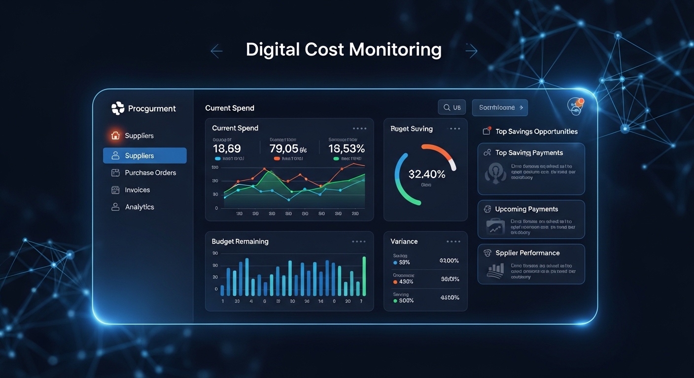
In recent times’ production and infrastructure panorama, price overruns aren’t visible as minor setbacks—they are essential dangers that could compromise profitability and venture credibility. Digital transformation has added wise procurement structures that permit project businesses to tune, forecast, and manipulate expenses in real time. Through included dashboards, automated approvals, and centralized provider verbal exchange, businesses can eliminate blind spots in spending and gain full visibility into procurement cycles from requisition to charge.
One of the principal areas taking advantage of virtual tracking is Procurement Consulting Services, in which furniture, fixtures, and equipment expenses can without issue boom due to design adjustments, shipping delays, or enterprise markups. Smart procurement applications create transparency with the aid of way of the use of linking issuer fees, buy orders, and shipping schedules into a unmarried virtual environment Instead of relying on spreadsheets and guide tracking, businesses can display devoted charges as opposed to real fees right away, lowering the risk of unexpected financial gaps.
The Rise of Real-Time Procurement Intelligence
Modern procurement applications aren’t clean ordering structures; they feature as economic intelligence equipment. They integrate rate variety allocation, provider simple performance metrics, and approval workflows properly into a unified interface. Project managers can examine budgeted prices with actual-time commitments and come upon variances early.
For instance, if an assignment has a budget of $500,000 and procurement statistics indicate $420,000 has already been dedicated, with 30% of the timeline remaining, digital dashboards can, without delay, flag a capability overspend danger. Instead of discovering the trouble at task closeout, businesses can negotiate dealer discounts or adjust quantities without delay. This proactive method dramatically improves financial trouble.
Data-Driven Forecasting and Budget Alignment
Digital rate monitoring systems are even more powerful when related Construction Estimating Services ensuring that the baseline finances are correct in advanceofn procurement starts offevolved offevolved offevolved. When estimated facts flows proper now into the procurement software application, discrepancies between projected and real fees turn out to be less difficult to find. This alignment creates a continuing bridge between planning and execution.
Consider a project expected at $2 million. If virtual tracking shows procurement commitments attaining $1.6 million at a first rate 60% undertaking of 60% completion, predictive analytics can calculate a capacity 10–15% overrun. Project managers can then re-examine dealer contracts, revise procurement schedules, or look for possible vendors earlier than charges spiral further. By combining historical facts with contemporary shopping for patterns, smart systems offer actionable monetary forecasts in contrast to static reviews.
Automation, Compliance, and Risk Reduction
Another vital gain of smart procurement systems is automation. Manual approval techniques often result in delays and inconsistencies. Automated workflows ensure that each buy request passes through predefined authorization stages, decreasing unauthorized spending. Digital audit trails also simplify compliance reporting and financial responsibility.
Risk mitigation will become appreciably less difficult at the same time as rate thresholds are embedded inside the gadget. For instance, if a department tries to exceed its allocated $a hundred,000 restriction, the tool can robotically flag or block the request. This primarily based totally manipulate surroundings protects earnings margins and ensures procurement aligns with contractual budgets.
Design Integration and Cost Visualization
Smart procurement programs more and more combine with layout structures and documentation workflows. When related to CAD Drafting Services, procurement teams gain early visibility into fabric specs and quantities. Design revisions robotically replace procurement lists, lowering high-priced reorders and wastage.
Imagine a scenario wherein a layout trade increases the flooring amount by500 square meters. Without digital integration, the value implication might mobemitted till invoices arrive. With integrated systems, the software recalculates procurement totals without delay and adjusts economic forecasts. This synchronization between layout and buying complements transparency and strengthens desire-making accuracy.
Analytics, Vendor Performance, and Strategic Insights
Beyond monitoring fees, digital procurement structures provide superior analytics on providers’ usual performance, pricing consistency, and delivery timelines. By comparing provider bids across more than onetask, corporations can take advantage of price-saving opportunities and negotiate higher contracts.
For example, if analytics reveal that Supplier A continuously offers materials 8% less expensive than the opposition while maintaining best practices, long-term framework agreements can be established. Over a $1 million annual procurement budget, this difference needs to translate into big financial savings without compromising overall performance. Smart dashboards rework uncooked financial statistics into strategic notions, permitting procurement to shift from transactional operations to value-driven leadership.
Read more: What Is a Pipe Spool? A Complete Guide to Design and Fabrication
Final Thoughts
Digital price tracking through clever procurement programs is redefining financial management in production and infrastructure tasks. By connecting budgeting, estimation, layout coordination, and dealer control into one smart environment, corporations can get rid of guesswork and gain real-time fee visibility.
From early planning to the very last transport, covered systems empower companies to assume financial risks, optimize issuer relationships, and preserve a strict budget. As tasks develop more complex and margins tighten, adopting digital procurement answers is not optional—it’s far more important for sustainable profitability and operational excellence.
Frequently Asked Questions
- What is digital fee tracking in procurement?
Digital rate monitoring refers to the usage of software programs that track purchasing sports activities, commitments, and expenses in real time to prevent charge variety overruns and enhance financial transparency.
- How do smart procurement packages reduce assignment risks?
They offer automated approvals, spending signals, and predictive analytics that turn out to be aware of functionality fee overruns in advance than they beautify, permitting early corrective movements.
- Cana procurement software program combine with layout and estimating tools?
Yes, present-day structures combine with estimating and layout structures to synchronize quantity updates and monetary forecasts automatically.
- Is digital procurement suitable for small tasks?
Absolutely. Even smaller duties benefit from centralized provider management, obvious budgeting, and decreased administrative workload.
- How does analytics beautify provider preference?
Analytics compares pricing records, transport traditional overall performance, and excellent data, supporting groups pick reliable businesses whilst negotiating competitive prices.
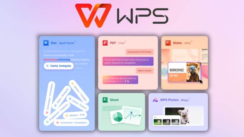
The first step taken by the users is WPS download when they desire a strong and user friendly office suite that meets the requirements of modern documents. Once the installation and activation is successfully done the set of advanced features that facilitate productivity document quality and collaboration has a broad availability to the user. This article gives a full description of what can be offered following the downloading of WPS with proper headings, proper paragraphs and well defined conclusion to enable the readers to fully appreciate the value of the same article.
The introduction to WPS Office After Activation
When WPS Office is turned on, the users learn the full extent that it has in addition to viewing the basic documents. The activated version has a more powerful writing editing presenting and file management tools. The WPS Office is developed with the aim of fulfilling the needs of students as well as those of professionals and businesses as it is simple yet very sophisticated. Activation will provide an access to premium features with regular updates and an improved user experience across devices.
Creation and Editing of documents
Upon download activation, the users of WPS are able to edit and create the documents using the tools of professional level. The word processor has rich text formatting templates and layout advanced features. Users are able to comfortably modify fonts spacing margins and alignment to come up with high quality documents. Grammar suggestions and word count tools can direct and enhance the accuracy and clarity of writing with the help of spell checking. These characteristics help in quick and reliable document preparation to be used in day-to-day activities.
Spreadsheet Tools and Data Control
The spreadsheet element is then powered up. Formulas charts and pivot tables allow users to work with large datasets. Information is analyzed with the help of data sorting filtering and conditional formatting. The interface is also user friendly and simple to use by the beginner but at the same time it has richness to suit the advanced users. When the WPS download is turned on the spreadsheet performance is better and file is compatible with other office formats.
Presentation Design and Image Improvement
Another strong feature of the WPS office is presentation creation. There are also premium templates and effects of animation available to the activation user. Slides could be personalized with transitions charts picture and multimedia materials. Presenter tools facilitate the control of the slides in meetings or lectures. These characteristics enable one to develop captivating presentations that can be used in professional and educational setting.
File Synchronization and Cloud Storage
Cloud integration is one of the greatest post-WS download activation benefits. The users are able to save their documents in an online environment and use them on a variety of devices. Changes are automatically synchronized so that they are saved on-the-fly. This is particularly beneficial to those users who alternate between desktop and mobile platform. Backup protection is also offered by cloud storage which minimizes the chances of losing data.
PDF Conversion and Document Conversion
Activated WPS Office has enhanced PDF capabilities which are more than the simple viewing capabilities. The users are allowed to easily create edit and annotate PDF files. One is able to add text pictures and comments to PDFs. The file conversion tools enable the users to be able to translate the file between the Word Excel PowerPoint to a PDF file without quality being compromised. The tools save time and do not require the implementation of other software.
Teamwork and Teamwork skills
Easy cooperation is facilitated upon activation. Users are able to share documents with other people and regulate access rights. Instant commenting and revision history assist the teams to collaborate effectively. Version history enables one to see the way past changes and undo earlier changes should it be essential. These collaboration tools facilitate working remotely and collaborative work.
Customization Options and User Interface
WPS Office has a clean interface that is customizable. Once the users have WPS download activation they can customize the toolbars themes and layouts to their liking. The dark mode and reading mode can be used to ease eye tension when the working time is long. QuickAttach and keyboard shortcuts are used to make the work faster and more efficient.
Security and File Protection Features
WSP office has a feature of security. Documents can be safeguarded by passwords and encryption by the activated users. Sensitive files could be locked out to ensure that they are not accessed by unauthorized personnel. The data protection against the possible threats is guaranteed with secure cloud storage and regular updates. These measures render WPS Office appropriate in the management of confidential information.
Cross Platform Compatibility and performance
WPS office is compatible with various operating systems such as Windows Mac Android and iOS. It is optimized after activation performance has been improved and loading time is found to be lower and the use of system resources is less. The files that are generated in WPS Office can be shared and collaborated with other office suites that are popular hence there are no complications in formatting.
Inclusions and regular updates as well as Premium Support
The other benefit of activation is that it has access to frequent software updates. Such updates add features, enhance stability and address bugs. Customers also enjoy better customer service that is offered to premium users and can solve problems promptly. This support is also a guarantee that users who use WPS Office on a daily basis will have a reliable long term experience.
Conclusion
The WPS download activation gives a full suite of features that can be used to increase productivity creativity and collaboration. Between sophisticated document editing and spreadsheet analysis to cloud storage PDF software and security options the activated version is of fine value to users of any caliber. Offering cross platform functionality and constant updates WPS Office has become a stable solution to the operations of the modern office with the user friendly interface. The option to download WPS and its subsequent activation is a brilliant step to any person who wants to have an all-encompassing and effective experience with office software.

In today’s competitive hospitality market, attracting website visitors is only half the challenge the real success lies in converting those visitors into confirmed bookings. Guests expect quick answers, personalized recommendations, and a seamless online experience. When hotels fail to provide this, potential guests abandon the website and book elsewhere. Purple Square AI’s AI Booking Assistant for hotels solves this problem by delivering an intelligent, interactive, and conversion-focused booking experience that turns browsers into paying guests.
This next-generation AI tool acts as a digital sales agent, guiding users through the booking journey with accuracy, speed, and personalized support. Here’s how Purple Square AI is helping hotels increase conversions like never before.
Transforming the Hotel Booking Journey with Intelligent Automation
The AI Booking Assistant engages website visitors instantly, ensuring no inquiry is missed. With advanced conversational AI, it communicates naturally, understands user intent, and provides helpful suggestions to move guests toward a booking decision.
Instead of navigating multiple pages or waiting for email responses, guests receive immediate support reducing friction and increasing the likelihood of completing a reservation.
Personalized Recommendations That Drive More Bookings
Each traveler is unique, and personalization can make or break a booking decision. Purple Square AI’s platform analyzes guest preferences and behavior to offer customized suggestions such as:
- Ideal room types
- Relevant promotions or upgrades
- Package deals tailored to travel dates
- Add-on services like breakfast, spa, or airport transfers
These personalized recommendations make guests feel understood and increase the chances they’ll finalize their booking.
Instant Answers to Common Questions That Prevent Drop-Offs
When guests can’t find information quickly, they often leave the website. Purple Square AI’s Booking Assistant provides real-time answers to key questions about:
- Pricing and availability
- Amenities and policies
- Check-in/check-out times
- Cancellation terms
- Special requests
By offering instant clarity, the assistant reduces uncertainty and keeps the user engaged boosting conversion rates significantly.
24/7 Availability to Capture Global Bookings
Guests browse at all hours, especially international travelers. The AI Booking Assistant ensures round-the-clock support, regardless of time zones.
This nonstop accessibility allows hotels to capture bookings even when staff are unavailable maximizing revenue opportunities and reducing dependency on call centers.
Smart Upselling to Increase Revenue Per Booking
Purple Square AI doesn’t just improve conversions; it also drives higher revenue. The AI Booking Assistant intelligently recommends upgrades and add-ons such as:
- Premium rooms or suites
- Romantic or family packages
- Early check-in or late check-out
- On-site dining or spa services
These suggestions feel natural and helpful, resulting in increased spend per reservation without aggressive sales tactics.
Seamless Integration with Hotel Booking Engines
Purple Square AI’s AI Booking Assistant integrates seamlessly with leading booking engines and PMS platforms. This ensures smooth transitions from inquiry to confirmed reservation, without disrupting existing workflows.
Guests can:
- Check availability
- Compare room options
- Apply promo codes
- Complete secure bookings
All within a guided, user-friendly interface powered by AI.
Turning Website Traffic Into Direct Revenue
Direct bookings are among the most profitable channels for hotels because they reduce OTA commissions. Purple Square AI boosts direct revenue by:
- Keeping guests on the hotel’s website
- Answering questions instantly so users don’t leave to search elsewhere
- Guiding guests step-by-step to complete their reservation
- Providing trust-building reassurance and clarity
More conversions mean higher profitability and better control over guest relationships.
Comprehensive Analytics for Smarter Decision-Making
Every interaction provides valuable insights. Purple Square AI offers detailed analytics on user behavior, drop-off points, common questions, and conversion trends. Hotels can use this information to refine their marketing, improve user experience, and optimize pricing strategies.
Data-driven decision-making leads to consistent improvements in booking performance.
Why Hotels Choose Purple Square AI’s Booking Assistant
Purple Square AI’s solution is built specifically for hospitality and offers unmatched benefits:
- Fast and easy deployment
- Customizable chatbot personality and responses
- Enterprise-grade data security
- Multilingual support for global travelers
- Continuous AI learning for better accuracy over time
Hotels of all sizes from boutique properties to large international brands benefit from improved conversions and smoother guest interactions.
Final Thoughts
Increasing conversions requires more than an attractive website. It demands personalized engagement, instant responses, and an effortless booking experience. Purple Square AI’s AI Booking Assistant delivers all of this and more helping hotels convert more visitors into guests, boost direct bookings, and enhance revenue.
As the hospitality industry continues to evolve, hotels that invest in AI-powered booking solutions will be the ones leading the market. With Purple Square AI, the future of hotel bookings is intelligent, efficient, and guest-focused.

Radiocommunication is essential in various sectors throughout Mexico—from public safety to industry and navigation. In this context, RadioRed has become one of the country’s leading online stores specializing in this field. Based in Monterrey, Nuevo León, RadioRed offers a wide range of communication radios and accessories from well-known brands like Kenwood, ICOM, Motorola, and Hytera. You can visit their official website at radiored.com.mx.
Extensive Range of Products
Portable Radios
Portable radios are fundamental for maintaining communication while on the move. RadioRed provides a variety of models designed for different needs. One of the top-selling models is the KENWOOD NX1300NK4, a digital and analog radio with 64 channels, encryption, and roaming capabilities—ideal for high-security and high-mobility environments. Another popular option is the KENWOOD TK-3000-KV2, known for its robustness, compact size, and compliance with MIL-STD-810 military standards. This makes it a preferred choice for industrial and field applications.
Mobile Radios
For applications that require stable communication in vehicles or base stations, mobile radios are the perfect solution. RadioRed offers the KENWOOD NX-5800-K2, a UHF mobile radio that comes with Bluetooth, GPS, noise cancellation, and compatibility with protocols like NXDN, DMR, and P25. With 1024 channels, this radio is ideal for fleet management, field operations, and emergency services. It enables secure, clear, and reliable communication over long distances, even in complex environments.
Intrinsically Safe Radios
In high-risk industrial environments where flammable gases or explosive materials are present, it is crucial to use intrinsically safe radios that meet international safety standards. RadioRed offers ATEX- and IECEx-certified radios that ensure both user safety and the operational integrity of equipment in potentially explosive atmospheres. These radios are frequently used in oil refineries, chemical plants, and mining operations throughout Mexico.
Marine and Aviation Radios
For maritime and aeronautical navigation, having clear and reliable communication tools is vital. RadioRed offers marine radios that are water-resistant and buoyant, designed specifically to function under harsh environmental conditions. Brands like ICOM offer models such as the IC-M25 and IC-M94D, which are ideal for communication between vessels, docks, and marine personnel. In aviation, radios like the ICOM IC-A25C provide dependable communication in the air, ensuring the safety of pilots and crews.
PoC Radios (Push-to-Talk over Cellular)
PoC technology (Push-to-Talk over Cellular) combines the simplicity of traditional radios with the power of 4G/LTE networks. This modern communication tool allows users to connect instantly using cellular coverage, without the need for repeaters or private radio frequencies. RadioRed offers a variety of PoC radios that are compatible
with Android and iOS systems, allowing companies to track personnel, communicate via GPS, and manage operations in real time from anywhere in the country.
Repeaters and Accessories
To improve signal coverage and communication quality across large areas, repeaters are essential. RadioRed carries high-performance repeaters from brands like Kenwood and ICOM that can significantly extend the range of your communication network. In addition, they offer a wide range of accessories including antennas, batteries, chargers, remote speaker microphones, earphones, programming cables, and belt clips. These accessories help users customize and enhance their communication equipment based on their operational needs.
Featured Brands
Kenwood
Kenwood, a Japanese brand, is world-renowned for its audio and communication equipment. Their two-way radios are known for their superior quality, reliability, and resistance to harsh environments. At RadioRed, you can find both analog and digital Kenwood radios that are suitable for industries like construction, security, transportation, and emergency services.
Top products include:
- KENWOOD NX1300 Series: Offers multi-protocol support, robust build, and advanced digital features.
- KENWOOD TK Series: Compact, durable, and user-friendly analog radios for basic communication needs.
ICOM
ICOM is another Japanese manufacturer with an excellent reputation in the field of radiocommunication. Their products serve a broad range of industries, from amateur radio enthusiasts to professional maritime and aviation users. With robust waterproof designs and long battery life, ICOM radios are ideal for demanding environments.
Popular models include:
- ICOM IC-F1000 / F2000: Digital/analog portable radios with built-in voice recording and motion detection.
- ICOM IC-M73 / M25: VHF marine radios with IPX8 waterproof ratings.
Motorola
Motorola is an American brand with decades of experience in communication technology. Their radios are widely used by public safety agencies, first responders, and private security companies. Known for their high-quality construction and cutting-edge technology, Motorola radios offer exceptional performance in mission-critical situations.
Notable models include:
- Motorola MOTOTRBO Series: Digital radios with advanced features like GPS tracking, text messaging, and remote monitoring.
- Motorola CP200d: A digital/analog radio ideal for seamless migration from analog systems.
Hytera
Hytera, a leading Chinese manufacturer, offers innovative two-way radios and PoC solutions. Their radios are popular for their modern design, cost-effectiveness, and excellent range of features for both digital and analog users.
Key models:
- Hytera PD562: Compact and lightweight digital radio with clear audio and long battery life.
- Hytera PNC370: A PoC radio designed for nationwide communication using 3G/4G/Wi-Fi networks.
Deals and Promotions
One of RadioRed’s strengths is its competitive pricing and frequent promotions. The store regularly offers discounts on a wide selection of products. For instance, the KENWOOD TK-3000-KV2, usually priced around $4,600 MXN, is often available at a 29% discount. Similarly, package deals and combo offers are available for customers looking to purchase multiple radios or complete communication systems at a lower cost.
Promotions can be found directly on their homepage, where seasonal sales, clearance events, and brand-specific discounts are updated regularly.
Technical Support and Consulting
Beyond just selling products, RadioRed prides itself on providing top-tier customer service and technical support. Their team includes certified communication professionals who help customers select the most appropriate equipment based on usage scenarios, budget, and performance expectations.
They also offer:
- Programming and configuration services
- Repairs and maintenance
- On-site installation support
- Training and tutorials on equipment usage
Whether you’re a first-time buyer or an experienced communications manager, RadioRed ensures you get the support needed to make the most out of your investment.
The Importance of Radiocommunication in Mexico
Radiocommunication plays a crucial role in the infrastructure and security of many Mexican industries. In rural and remote areas where cellular coverage is limited, radio systems remain the most reliable method of communication. In cities, construction companies, transport fleets, and logistics operations depend on radio systems to coordinate activities efficiently and safely.
Some key sectors that rely heavily on radio systems include:
- Public Safety: Police, firefighters, and paramedics use radios for real-time coordination during emergencies.
- Construction: Site supervisors and crane operators communicate over radios to ensure safety and efficiency.
- Mining and Energy: Intrinsically safe radios are essential in environments with explosive gases and materials.
Agriculture: Large farms use mobile radios to coordinate workers and machinery across wide areas.
By offering products suited to each of these sectors, RadioRed plays a critical role in enhancing operational safety and efficiency across Mexico.
Testimonials and Customer Experience
Customers across Mexico report high satisfaction with RadioRed’s fast delivery, expert advice, and quality assurance. Many clients from industries like logistics, security, and hospitality note that RadioRed’s radios help streamline their internal communication and improve workplace safety.
Shipping and Coverage
RadioRed offers nationwide shipping across all Mexican states, including remote areas. Orders are processed quickly, and delivery options include express and standard shipping through trusted couriers. They also provide tracking options and warranties for all purchases.
Final Thoughts
With a solid track record, expert-level support, and a wide selection of top-brand products, RadioRed stands out as the number one online store in Mexico for radiocommunication equipment. Whether you’re managing a fleet of trucks, coordinating a hotel security team, or navigating a fishing vessel on the Pacific coast, RadioRed has the tools and expertise to keep you connected.

Introduction: The Rise of Cullins UT20
In today’s world of fast-paced technological growth, Cullins UT20 has emerged as a remarkable innovation that bridges the gap between performance and efficiency. Designed with modern advancements, the Cullins UT20 brings together durability, smart engineering, and user-centered design. Whether used in industrial settings, research, or engineering applications, this next-generation model is redefining what’s possible through intelligent functionality and sustainable design.
What Makes Cullins UT20 Unique?
Unlike traditional models that focus solely on output, Cullins UT20 introduces a balance between energy efficiency and long-term performance. The creators of Cullins UT20 aimed to develop a system that minimizes waste, enhances productivity, and delivers precise results consistently.
Its design is based on modern user demands high efficiency, minimal maintenance, and eco-friendly operation. This makes Cullins UT20 not just a tool, but a comprehensive solution for professionals seeking dependability and innovation in one package.
Core Features of Cullins UT20
The Cullins UT20 offers a variety of features that make it stand out from similar technologies. Below are the most impressive ones:
1. Advanced Power System
Built with a new-generation power unit, Cullins UT20 ensures consistent output without overheating or excessive energy consumption. Its system intelligently adjusts performance based on workload, resulting in stable and efficient operations.
2. Energy Efficiency at Its Best
The Cullins is engineered with a focus on sustainability. It consumes significantly less energy while maintaining high productivity, making it an eco-conscious choice for modern businesses and industries.
3. High-Quality Build
Durability is one of the strongest aspects of Cullins UT20. Manufactured with premium-grade materials, it’s resistant to wear and capable of performing reliably in demanding environments.
4. Smart Control System
The intuitive digital control interface of Cullins allows users to customize operations easily. Its responsive system enhances usability and supports precise control, even for complex projects.
Applications of Cullins UT20 in Modern Industries
The Cullins UT20 is versatile, making it valuable in multiple fields due to its adaptability and efficiency.
Manufacturing
In manufacturing, Cullins optimizes output while reducing production downtime. Its precision-driven technology ensures smoother processes and higher quality standards.
Automotive Engineering
The Cullins UT20 supports advanced mechanical and testing functions in the automotive sector. It enables engineers to achieve accurate calibration and real-time performance tracking.
Construction and Infrastructure
For construction companies, Cullins delivers durability and reliability. It withstands harsh working conditions and assists in performing high-intensity operations with minimal maintenance.
Research and Development
Research labs rely on Cullins for data precision and consistency. Its smart configuration allows researchers to analyze outcomes more efficiently, making it an excellent choice for experimentation and testing.
Top Benefits of Using Cullins UT20
Investing in Cullins comes with long-term advantages that make it a worthwhile addition for professionals and industries alike.
-
Superior Efficiency – The optimized system ensures smooth and fast performance with reduced energy use.
-
Sustainability – Its eco-friendly operation helps organizations meet environmental goals.
-
Long-Term Value – Built for endurance, Cullins minimizes repair costs and extends product lifespan.
-
Reliability – Users can depend on it to perform consistently under all working conditions.
-
Modern Design – A sleek, user-focused interface that enhances both usability and aesthetics.
The Technology Behind Cullins UT20
At the heart of Cullins lies its smart integration of sensors and control algorithms. These technologies allow it to automatically adjust performance according to environmental factors and workload. The system’s predictive maintenance feature alerts users before issues arise reducing downtime and improving productivity.
This level of automation and intelligence shows how Cullins UT20 embodies the principles of Industry 4.0, blending hardware strength with digital innovation.
Why Industries Prefer Cullins UT20 Over Competitors
The Cullins holds a strong position in the market due to its ability to outperform other systems in the same category. Its versatility, energy efficiency, and intelligent controls make it the preferred choice for professionals aiming to achieve both performance and sustainability.
Unlike older technologies that rely heavily on manual settings, Cullins UT20 simplifies complex operations through automation and digital monitoring, reducing human error and saving time.
Future Outlook of Cullins UT20
The development team behind Cullins is committed to continuous improvement. Future versions are expected to include cloud connectivity, enhanced AI learning capabilities, and remote diagnostics. These updates aim to make the Cullins UT20 even more adaptive and efficient for future industrial and research needs.
As global industries shift toward automation and sustainability, Cullins UT20 is expected to remain at the forefront of innovation offering smarter solutions to evolving challenges.
Conclusion: The Significance of Cullins UT20
To sum up, Cullins is more than an advanced piece of technology it represents a forward-thinking approach to design, performance, and environmental responsibility. Its exceptional combination of power, smart control, and reliability makes it a trusted solution across industries.
As technology continues to evolve, the Cullins will undoubtedly play a crucial role in shaping a more efficient, sustainable, and intelligent future.
-
 Entertainment5 months ago
OGFap Review: Pros, Cons, and User Experience
-
 Fashion5 months ago
Comme des Garcons: The Iconic Avant-Garde Fashion Brand
-
 Blog6 months ago
i̇ns: Exploring Its Meaning, Values, and Modern Impact
-
 Blog6 months ago
鲁Q 669FD License Plate Lookup – Car History & Vehicle Records
-
 Uncategorized6 months ago
Manga18fz: A Complete Guide to the Trending Manga Platform
-
 Life Style5 months ago
The Ultimate Guide to Halloween Contacts for Eyes: Everything You Need to Transform into Your Darkest Character
-
 Fashion4 months ago
Custom Jersey Printing: Designing Your Team’s Identity with SeamJersey
-
 Technology6 months ago
Simpcit6: Unlocking the Next Phase of Digital Simplicity